Wellness Packaging That Sells & Complies : Design Principles & FDA Essentials
Your packaging has two jobs: sell the product and stay compliant. Here's how to nail both — without the costly redesigns that trip up new founders.

Your packaging is your silent salesman—and your legal liability.
In our experience executing 300+ wellness brand projects globally, we have seen beautiful brands recalled because of a font size error on the back label.
The most successful founders understand that wellness product packaging must satisfy two masters: the customer's eye (design) and the regulator's rulebook (compliance). You cannot have one without the other.
The "Unboxing" Economy
In the digital age, your packaging is the only physical touchpoint you have with your customer. For a direct-to-consumer (DTC) wellness brand, the "unboxing moment" is often the difference between a one-time purchaser and a loyal subscriber.
But designing for wellness is trickier than designing for fashion or tech. You aren't just selling a lifestyle; you are selling health. This means you are operating under the scrutiny of agencies like the FDA (US), MHRA (UK), or Health Canada.
Whether you are launching a "Side-Hustler Sarah" budget brand or a "Serial Entrepreneur Lisa" scaling operation, navigating the intersection of beauty and bureaucracy is critical.
This guide, part of our BUILD Pillar, covers the essential design principles that drive sales and the non-negotiable compliance checklists that keep you out of trouble.
1. Design Principles: The "Sells" Part
Your packaging has about 3 seconds to convince a browser (online or on-shelf) to stop and look. Here is how to make it "sticky".
A. Visual Identity Fundamentals
Before you pick a bottle shape, you need a visual strategy.
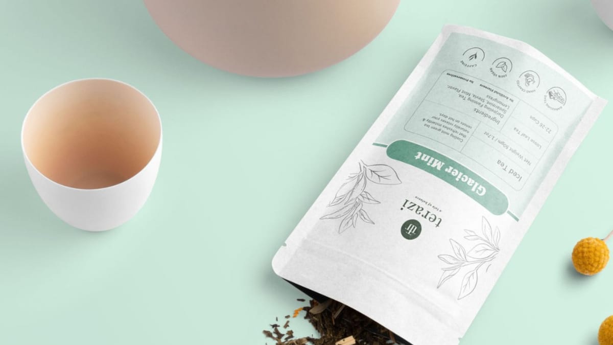
- Color Psychology: In wellness, color signals function. Blue often signals "sleep" or "calm" (Magnesium). Green signals "natural" or "gut health" (Greens powders). Orange/Yellow signals "energy" (Vitamin C). Don't fight the consumer's subconscious expectations.
- Typography Hierarchy: Your customer wants to know what it is and what it does instantly. Do not bury the product name in script fonts.
- Primary: Brand Name.
- Secondary: Product Identity (e.g., "Ashwagandha Root").
- Tertiary: The Benefit (e.g., "Stress Support").
B. The Tactile Experience
Wellness is sensory. The feel of the packaging communicates the quality of the ingredients.
- Glass vs. Plastic: Glass jars (amber or miron violet) suggest premium quality and protect light-sensitive supplements.
- Soft Touch Finishes: Matte or "soft touch" laminates on boxes create a premium feel that justifies higher price points.
C. Sustainable Wellness
In 2026, "sustainable wellness" is not a trend; it's a requirement. Consumers are increasingly rejecting excessive plastic.
- Materials: Consider PCR (Post-Consumer Recycled) plastics, glass, or compostable pouches for refill systems.
- Messaging: If your packaging is eco-friendly, print that clearly on the box. It is a key conversion driver.
2. FDA Essentials: The "Complies" Part
This is where the "Practitioner-Led Knowledge" of Brand Sewa is vital. A graphic designer knows how to make things pretty; a brand architect knows how to make them legal.
A. The 5 Mandatory Label Elements (FDA)
For dietary supplements in the US, your wellness product packaging must include these five elements on the Primary Display Panel (PDP) or Information Panel:
- Statement of Identity: What is it? (e.g., "Dietary Supplement" or "Herbal Tea"). This must be bold and clear.
- Net Quantity of Contents: How much is in there? (e.g., "60 Capsules" or "Net Wt. 4oz"). This must be placed in the bottom 30% of the front panel.
- Nutrition/Supplement Facts Panel: A strictly formatted box listing serving size, servings per container, and ingredient amounts. You cannot design your own style here; you must follow the code.
- Ingredient List: A list of "Other Ingredients" (fillers, capsules, flavors) listed in descending order by weight.
- Name and Place of Business: The manufacturer, packer, or distributor's name and address.
B. The "Claims" Danger Zone
Your packaging cannot promise to cure, treat, or prevent disease.
- Illegal Claim: "Cures Insomnia."
- Legal Structure/Function Claim: "Supports Restful Sleep."
- Mandatory Disclaimer: If you make a structure/function claim, you must include the asterisk (*) linking to the FDA disclaimer: "This statement has not been evaluated by the Food and Drug Administration. This product is not intended to diagnose, treat, cure, or prevent any disease.".
3. Sourcing Packaging: Margins & MOQs
Sourcing is where your design meets your budget.
A. Stock vs. Custom
- Stock Packaging: Buying standard white or amber bottles and applying a custom label.
- Pros: Low MOQs (Minimum Order Quantities), cheap.
- Cons: Looks generic.
- Best For: Startups with <$5k budget.
- Custom Packaging: Custom molds, colors, or printed boxes.
- Pros: High brand equity, stands out.
- Cons: High MOQs (5,000+), high tooling costs.
- Best For: Scaling brands or funded launches.
B. The Labeling Strategy
If you are bootstrapping, use "pressure-sensitive labels" on stock bottles. You can order high-quality labels in small runs (rolls of 250) fairly cheaply. This allows you to iterate on your design without throwing away thousands of printed bottles.
4. Quality Control & Testing
Your packaging is also a safety device.
- Safety Seals: Ingestible products generally require a tamper-evident seal (neck band or induction seal).
- Stability Testing: Does the packaging protect the product? Clear glass might look cool, but UV light destroys Vitamin C. Ensure your packaging material is compatible with your formula.
Design for Trust
Great wellness product packaging is a marriage of art and law. It captures attention on the shelf while reassuring the consumer (and the regulator) that the product is safe, legitimate, and effective.
Don't rush this stage. A labeling error can lead to a costly recall that bankrupts a young brand. Design with intent, audit for compliance, and build a brand that looks as good as it feels.
Frequently Asked Questions (FAQs)
1. Do I need a lawyer to review my packaging?
While we recommend it for high-risk categories, many founders use regulatory consultants or specialized services. At minimum, you must read the FDA’s "Dietary Supplement Labeling Guide" thoroughly.
2. Can I use eco-friendly packaging for liquids?
Yes, but it is harder. Glass is infinitely recyclable but heavy to ship. Aluminum is lightweight and recyclable. Bioplastics are improving but check compatibility with your specific liquid formula to avoid leaching.
3. What is the difference between "Supplement Facts" and "Nutrition Facts"?
"Nutrition Facts" are for conventional foods (like a protein bar). "Supplement Facts" are for dietary supplements (like a vitamin capsule). The formatting and rules differ slightly. Choose the category that fits your product's intent.
4. How do I choose the right font size for the label?
The FDA mandates specific minimum font sizes for the "Net Quantity" and "Identity Statement" based on the size of the package face. If your font is too small, your product is "misbranded".
5. Is "Made in USA" a regulated claim?
Yes. To claim "Made in USA," "all or virtually all" of the product must be made in the US. If you source vitamins from China and bottle them in the US, you generally must say "Made in the USA with globally sourced ingredients".